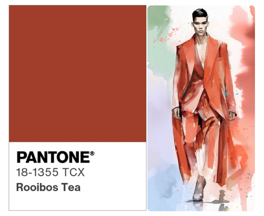
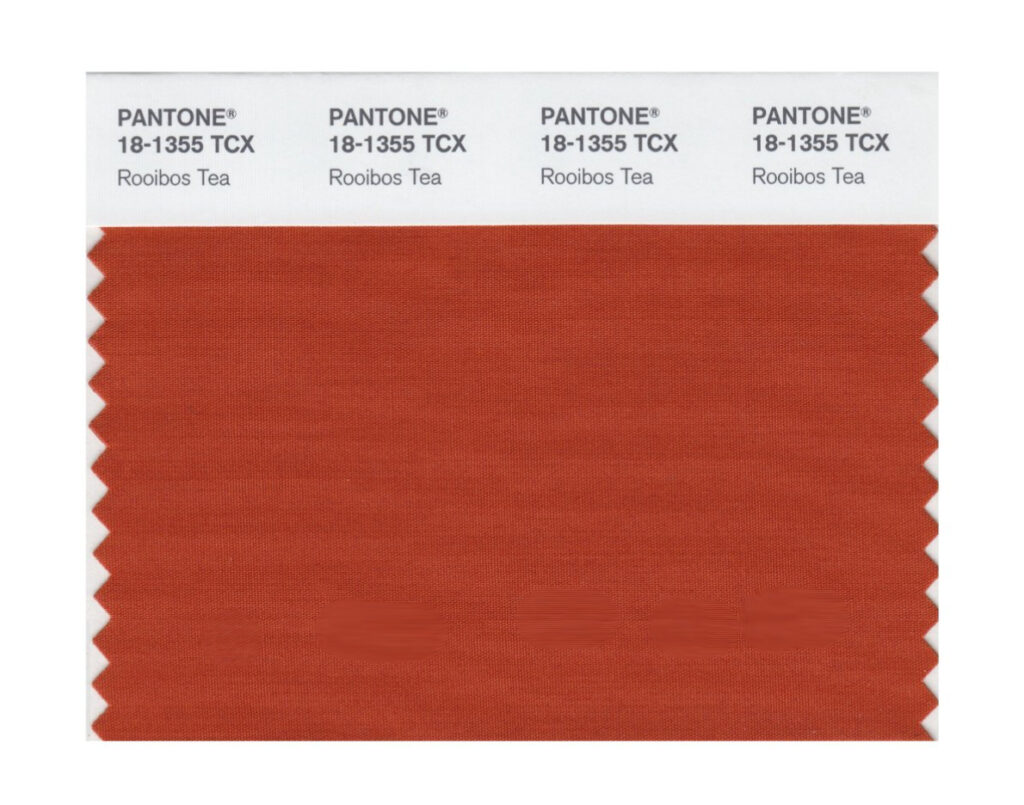
We’ll be seeing a lot more of the colour Rooibos on fashion ramps after the Rooibos Pantone® was announced as one of the top ten colours in the Fashion Colour Trend Report for spring 2024 at this past New York Fashion Week (NYFW).
Pantone LLC, the global authority on colour and provider of professional colour standards for the design industries chose the Rooibos Pantone® among 2390 other colours as one of the standout colours of 2024. An additional five new classic colours were also announced.
World-renowned colour specialist and executive director of the US-based Pantone Colour Institute, Leatrice Eiseman, says the new spring colour palette is a harmonious mix of familiar shades infused with a contemporary edge.
“Colours for NYFW Spring 2024 introduce a new interpretation of current times as memories of the past and a glimpse of the future”.
She referred to the Rooibos Pantone® as “restorative”.
“Just as people sometimes use food to revitalise themselves, the spring colour palette can be equally refreshing. The health benefits of herbal tisanes, for example, extend beyond personal wellness. They are restorative in every sense. They are refreshing to taste, but also refreshing to look at.
“The Rooibos Tea Pantone® 18-1355 is full-bodied, red imbued with rich, woody notes. The toned-down shade has the same effect as the shade of a dress that had been stowed away in a cedar chest for a while. Fashion brands like, Gucci, Zegna, Josie Natori, Bally, Emilio Pucci and Markarian’s Alexandra O’Neill are among the early adopters of the colour,” remarks Eiseman.

Marthane Swart, secretariat of the SA Rooibos Council (SARC) says the Rooibos industry is thrilled with the news.
“Fashion has always been the forerunner in setting colour trends. It was a big deal for us when the Rooibos Pantone® was first introduced in YEAR, but to have it singled out as a signature colour for the next spring/summer season exceeded our expectations by a long way.
“Fashion is the dynamic and ever-changing expression of style that in many ways reflect the collective imagination and cultural identity of a society. It also serves as a powerful means of self-expression and creativity – influencing how individuals present themselves to the world, shaping perceptions and celebrating the diverse tapestry of human individuality. We hope that when people wear the warm and inviting amber colour of Rooibos, it will evoke confidence, along with emotions of warmth, comfort, optimism, energy and passion.
“It has been an exciting journey to witness the rise of Rooibos and its adoption across industries. Being named a top ten colour for 2024 is sure to put the Rooibos Pantone® on the map,” says Swart.
Aside from seeing the colour popping up in new spring/summer fashion collections, experts say we can expect the colour to be used across industrial designs too, from cars, electronics, AI and technology to interiors, films and animation.
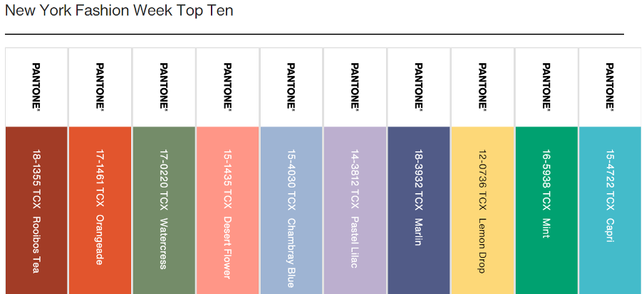
Here’s Pantone’s NYFW Spring/Summer 2024 Colour Palette:

With this news following on the heels of the announcement earlier this year that global fashion labels cited Rooibos as a hot new natural dye, we’re thrilled to see that the herbal tea we know and love is getting such prominent recognition!

